Doom Eternal - User Experience Researcher
First-person shooter | PC, Xbox, PlayStation | Id Tech 7
DOOM Eternal is a relentlessly fast-paced, first-person shooter that drops players into a hellish warzone where they battle demonic forces across Earth and beyond. As a User Experience Researcher on the project, I worked to ensure the game’s high-octane combat, layered systems, and aggressive visual design remained readable, responsive, and intuitive under pressure. Through player testing, telemetry analysis, and collaborative iteration with design and QA teams, I helped refine key elements of the HUD, onboarding, and weapon systems, enhancing clarity without compromising the game’s brutal identity.
My Role: User Experience Researcher
As a User Experience Researcher on DOOM Eternal, I partnered with cross-functional teams to investigate how usability, UI clarity, and gameplay flow held up under the game's famously fast-paced and chaotic combat design. I helped translate raw user feedback and behavioral data into actionable insights that improved the player experience while maintaining the creative vision.
Core Contributions
Research Objectives
• Are players overwhelmed during high-combat moments, and does the UI support decision-making?
• How effectively does the weapon switching system communicate options and timing?
• Does the HUD deliver vital information clearly, especially to new players?
• How effectively does the weapon switching system communicate options and timing?
• Does the HUD deliver vital information clearly, especially to new players?
Low Health Warning Visibility
UX Problem
During early playtests, we observed that players often failed to respond to critical health warnings in time which resulted in unnecessary deaths. Despite visual cues like red flashing, many players were so focused on the center of the screen that they simply didn't notice the alerts.
Observation
"I didn't even realize I was that low until I died."
Eye-tracking data confirmed this: most player focus remained tightly centered during combat, while peripheral HUD elements were often ignored. In fast-paced scenarios, subtle or corner-placed feedback was functionally invisible.
UX Solution
We introduced a centralized, adaptive low-health warning with a semi-transparent "LOW HEALTH" text alert placed near the crosshair, paired with a pulsing red vignette effect. This repositioned the warning to fall within the player's natural gaze path.
Impact
• 16% reduction in player deaths during low-health scenarios (post-change)
• 68% of players rated the new alert as "clear" or "very clear" vs. 39% before
• Designers acknowledged the change helped preserve intensity without sacrificing clarity
• 68% of players rated the new alert as "clear" or "very clear" vs. 39% before
• Designers acknowledged the change helped preserve intensity without sacrificing clarity

Heatmap Before UX Fix

Heatmap After UX Fix
Weapon Wheel Comprehension
UX Problem
The radial weapon wheel was powerful but unintuitive for new players. Early testing revealed that many participants struggled to select the correct weapon under pressure either because the layout or failed to recall what each icon represented.
Observation
"I kept opening it and second-guessing. I didn't know what was what."
Data showed that new players took 3.2 seconds on average to switch weapons, often hesitating or cancelling out of the wheel entirely.
UX Solution
We implemented contextual tooltips that briefly labeled each weapon during a player's first few uses. In addition, we improved icon readability by increasing contrast and adding a subtle hover pulse effect for feedback.
Impact
• Average weapon-switch time dropped to 2.5 seconds (22% faster)
• Post-test feedback reported a 41% improvement in perceived ease-of-use
• Designers added this tooltip system into the full onboarding sequence
• Post-test feedback reported a 41% improvement in perceived ease-of-use
• Designers added this tooltip system into the full onboarding sequence
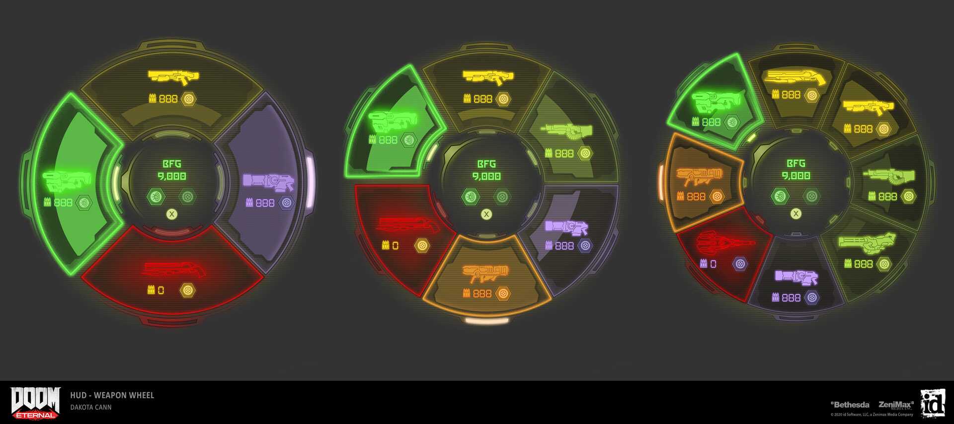
Dakota Cann's Weapon Wheel UI Art
Reflection
Working on DOOM Eternal taught me how to balance usability within an intentionally overwhelming, high-octane environment. I refined my skill in translating player behavior into precise, respectful suggestions that honored the vision while improving clarity, pacing, and onboarding.